









Colours are sneaky little storytellers. Before anyone reads a word, clicks a button, studies a logo or meets a character on the page, colour has already popped up, waved its little flag and whispered, “This is how this should feel.”
At Happydesigner, colour is never just a pretty finishing touch. It helps shape mood, personality and first impressions in children’s book illustration, character design, branding and logo design.
The fun bit? Colour does not need to shout to be powerful. Sometimes the smallest shade change can turn “calm and cosy” into “bright and bouncy”. So, let’s have a cheerful rummage through the colour box.
Key Takeaways
- Colour can shape how a design feels before anyone reads a single word.
- A palette works best when colours support each other, not when every shade tries to be the star of the show.
- The same colour can feel completely different depending on its shade, contrast and colour companions.
- Brand colours should reflect personality, audience and purpose, not just what looks lovely in the moment.
- In children’s books, colour can help show mood, guide the eye and make a story world feel more magical.
Did you know? A tiny shade change can turn a colour from calm and cosy to bright and bouncy, so which colour would tell your story best?
Why colour does more than look pretty
Colour is a bit like background music in a film. You may not always notice it straight away, but it is quietly telling you what to feel.
A soft blue can feel gentle. A fizzy orange can add energy. A deep purple can bring a sprinkle of mystery. The trick is not to pick a colour simply because it looks nice, but because it supports the story you want to tell.
That matters for all sorts of creative projects. A children’s book needs a palette that suits the story world, a logo needs suitable colours, and a website needs enough contrast to read. If you are building a business identity, our guide to building a strong visual identity is a handy place to start.
Colour feelings at a glance
Colour meanings are not fixed rules. Culture, context, shade, saturation and personal memories all play a part. Still, some colours often bring certain feelings with them, rather like guests arriving at a party with very obvious hats.
| Colour or palette choice | Mood it can suggest | Where it can work nicely |
| Soft blues | Calm, trust, thoughtfulness | Gentle brands, reflective stories |
| Sunny yellows | Joy, warmth, optimism | Playful details, cheerful characters |
| Fresh greens | Nature, balance, growth | Outdoor stories, eco brands |
| Berry reds | Energy, confidence, drama | Bold accents, statement logos |
| Warm neutrals | Comfort, softness, simplicity | Backgrounds, cosy storytelling |
| Deep purples | Magic, imagination, richness | Fantasy scenes, creative brands |
Palettes are conversations, not solo performances
A single colour can be lovely, but a palette is where the real magic happens. Colours behave differently depending on who they are sitting next to.
Navy with cream feels classic. Navy with coral feels livelier. Sage with beige feels earthy, while sage with blush pink becomes more whimsical.
Think of a palette as a little dinner party. Some colours chat beautifully. Some colours bicker. One loud colour may need to sit next to a calm one so the whole table does not turn into a visual custard fight.
A useful palette includes a main colour, supporting colours, accent colours and neutrals.
For business projects, our branding for small businesses service can help turn those colours into something consistent and full of character.
Colour in branding: helping people feel “yes, this is for me”
Brand colours are not just decoration. They help people decide, very quickly, whether your business feels like the right fit for them.
A children’s activity brand might suit bright, playful colours. A calm consultancy might need a quieter palette. A handmade gift business may feel wonderful in warm, cosy tones. A bold new food brand might need something with more zing.
Before choosing brand colours, ask:
- Should this feel lively or calm?
- Do we want quirky, polished, magical, earthy or elegant?
- Will these colours work on a logo, website, social post and flyer?
- Can people read the words clearly?
Your logo is often one of the first things people see, so colour choices matter. Our professional logo design service focuses on designs that feel memorable, suitable and full of personality.
Colour in illustration and children’s books
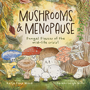
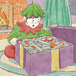
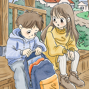
In children’s books, colour can guide young readers through the story before they fully understand the words. It can show whether a place is safe, strange, exciting or a little bit suspicious. It can also help a character leap off the page, especially if that character happens to be a cheeky squirrel.
A woodland scene might use mossy greens and warm browns to feel snug. A magical night-time adventure might use deep blues, purples and glowing yellows. A funny spread might use bright accents to pull the eye towards the action.
Colour can also support the rhythm of a story. Softer palettes can slow things down, brighter contrasts can add excitement, and a palette change can show that a character has moved from worry to courage.
For book projects, our make a children’s book service brings design, illustration and layout together.
Tiny shade changes, big mood shifts
Small colour choices can make a huge difference. There is a world of difference between cucumber green, goblin green and garden shed green.
A pale blue may feel dreamy, while a dark blue may feel more serious. A creamy white feels warm, while a stark white feels crisp. A dusty pink might feel gentle, while a hot pink has clearly had three lemonades and wants to dance.
When choosing colours, look beyond the basic name. Instead of asking, “Do we want green?” ask, “Which green tells the right story?”
A few useful checks:
- Is the palette too loud?
- Is the contrast strong enough for reading?
- Does it still look good in print?
- Does it suit the audience?
Our article on the psychology of colour in children’s books explores this idea further for authors and illustrators.
Common colour palette muddles
Colour choosing should be fun, but it can get messy. Happily, most muddles are easy to avoid.
Too many colours
If everything shouts, nothing gets heard. A smaller palette often feels more polished.
Chasing trends
Trendy colours can be tempting, but your brand or book needs to last longer than this month’s favourite shade of mushroom beige.
Forgetting readability
Pretty colours are not much help if nobody can read the words. Contrast matters, especially online.
Ignoring the audience
A palette should appeal to the people you want to reach, not just your own favourite colour from the pencil tin.
If you need practical design support, our graphic designer service can help keep things clear and purposeful.
How to build your own colour story
Start with feelings, not swatches. Choose three words that describe the mood you want. Perhaps “cosy, magical, gentle” or “bold, cheeky, adventurous”.
Then gather inspiration from nature, book covers, packaging, interiors, fabric or even the suspiciously stylish packaging of your favourite biscuits.
Try this simple process:
- Pick one main colour.
- Add two supporting colours.
- Choose one accent colour for sparkle.
- Add neutrals for space and balance.
- Test the palette on a logo, book cover or website banner.
- Step back and ask, “Does this feel like us?”
For more creative thoughts, pop over to the Happydesigner Happy Hub for inspiration, studio ramblings and colourful ideas.
Small shades, big feelings
A great palette does not just look nice. It helps people feel something. It can make a brand easier to recognise, a book world more immersive and a design feel wonderfully “right”.
Colour is subtle, but full of personality. The right palette can make your project feel warm, brave, playful, peaceful or gloriously odd in all the best ways.
If you are ready to bring your own colour story to life, get in touch and let’s make something beautifully, brilliantly you.
Further Reading
- Do We Feel Colours? A Systematic Review of 128 Years of Psychological Research: A detailed research review exploring how colours are linked with emotions across many studies, perfect for readers who fancy a deeper dive into colour feelings.
- Colour and Psychological Functioning: A Review of Theoretical and Empirical Work: A useful psychology review looking at how colour can influence mood, behaviour and perception, while also reminding us that context really matters.
- Using Colour to Enhance Your Design: A practical design article from Nielsen Norman Group on how colour can guide attention, set tone and support usability.
- Understanding Success Criterion 1.4.3: Contrast Minimum: A helpful W3C accessibility resource explaining why colour contrast is so important for readable, user-friendly design.