If you’re new to Happydesigner, then hello, welcome, and we hope you like the look!
If you’re one of our lovely customers or regular site visitors, we hope you’ve noticed the changes and found them fun, more informative, and helpful.
We’ve not ‘reinvented the wheel’ because we liked lots of the features of our old site. But we are, after all, about branding and visuals, and we felt we needed a bit of a refresh.
So, who better to take charge of this than our very own children’s book illustrator and creative extraordinaire, Sarah-Leigh!

“We wanted to make some changes, but we also wanted to keep the content and the structure because we have had so many nice comments from people about how they like the site and how it is easy to find what they are looking for,” says Sarah-Leigh.
“They don’t want to scroll through a load of irrelevant stuff. They like it to be simple, transparent, straightforward, easy to understand and easy to follow – just like us!”
Refreshing our brand
So what are the main differences between the old website (bye-bye..) and the new (hello there!)?
Colours.
If there is one thing central to the Happydesigner way of doing things, it is getting the colour palette right for each book illustration, branding, or logo project we undertake.
Sarah-Leigh explains, “Our old site represented the business at the time it was created and used lots of greys and greens, which was fine. But as we have grown and developed, we are more about me as the creative person, supported by Barry, who looks after all the operational side.”
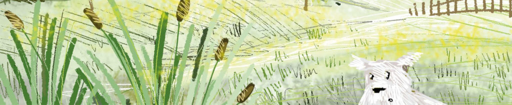
Going for green…
At Happydesigner we have really gone green! We donate a tree for every book we complete because we believe we have an obligation to help sustain the planet we live on.
And, because we realised just how much we were getting through every year, we no longer use paper and ink, and now everything we create and design is completed using state-of-the-art technology and the very latest software.
So, of course, we had to keep green in our colour palette!
A yen for yellow…
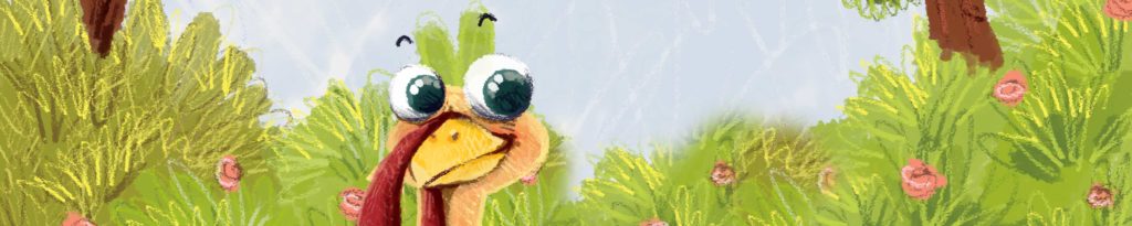
Because it is a personal favourite of Sarah-Leigh’s, and very much reflects her sunny character, we now feature much more yellow. For us, yellow means sunshine, smiles, daffodils, buttercups, celandines, cowslips… and lots of other wildflowers. Being outside with nature and having long walks in the countryside is so important to us as a team.
So that’s it; a fresh new look for Happydesigner, which reflects our company as a whole, and Sarah-Leigh as our creative lead. A friendly hub that people can come to when they want a children’s book illustrated, or a new logo, or to find some fabulous partners to team up with. We have kept the same level of detailed information but brought a little more life to the site, and made it much friendlier on the eye by revitalising the whole look and utilising a fresh colour palette.
That’s us, that’s Happydesigner. If you like the sound of us, we like the sound of you! Do get in touch – we’d love to chat.